OS X Yosemite Designed for Retina Screens?
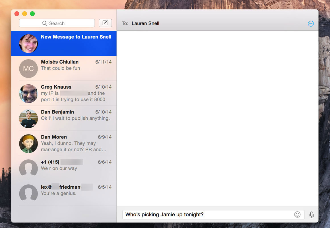
Macworld's Jason Snell provides a nice hands-on writeup about Apple's new OS X Yosemite. Snell focuses on the user-experience from a long term Mac user, focusing on the visual and usability changes of Mac windows. He notes the increased use of transparency and the varying implementation of title bars in many applications:

Overall, Snell feels that many of the design changes were done with Retina displays in mind:
For a while now, I’ve thought that 2014 would be the year that Retina spreads across the Mac product line. After spending time with Yosemite on both Retina and non-Retina systems, I’m more confident than ever in that guess. Yosemite’s new design feels like it was built for Retina displays: Thin Helvetica Neue replaces the long-serving but chunky Lucida Grande as the system typeface.
Apple first introduced Retina displays into the Mac line in with the Retina MacBook Pro in June, 2012. Since that time, Apple has been slow to extend Retina screens to the rest of their lineup.
The MacBook Air seems likely to be the next Mac to deliver a Retina Display. Signs point to a 12" Retina model later this year, and there has already been early evidence in Yosemite of Retina iMacs in testing.
Popular Stories
Bloomberg's Mark Gurman has high expectations for Apple's first foldable iPhone.
In his Power On newsletter today, he said the foldable iPhone will be "the most significant overhaul in the iPhone's history."
"iPhone 4, iPhone 6 and iPhone X were clearly a big deal, but this is a whole new design," he said.
Like Samsung's Galaxy Z Fold 7, the foldable iPhone will reportedly open up like ...
iOS 26.5 is now available for developers, and while it doesn't include any new Siri capabilities, there are some major changes for the European Union, and smaller tweaks for features available worldwide.
Suggested Places
In the Maps app, there's a new "Suggested Places" feature that recommends locations to visit based on trending places nearby and recent searches. When Apple launches ads in ...
Apple has been celebrating its upcoming 50th anniversary by hosting surprise performances and other events around the world over the past few weeks, and now Bloomberg's Mark Gurman has revealed details about the company's grand finale.
In a social media post, Gurman said Apple's celebrations will conclude this week with a finale at its Apple Park headquarters for employees.
A special...
Popular Stories
Apple on Monday unveiled the iPhone 17e and an updated iPad Air, but it is not finished yet. Apple promised "a big week ahead," and it is expected to announce additional new products this Tuesday, March 3 and Wednesday, March 4.
The most likely possibilities for Tuesday include updated 13-inch and 15-inch MacBook Air models with the M5 chip, and higher-end 14-inch and 16-inch MacBook Pro...
Apple today announced new 14-inch and 16-inch MacBook Pro models featuring M5 Pro and M5 Max chips, both built on a new Fusion Architecture that bonds two third-generation 3nm dies into a single chip using advanced packaging.
The Fusion Architecture is a first for Apple silicon, since previous chips used a single-die design. The two bonded dies house the CPU, GPU, Media Engine, Neural...
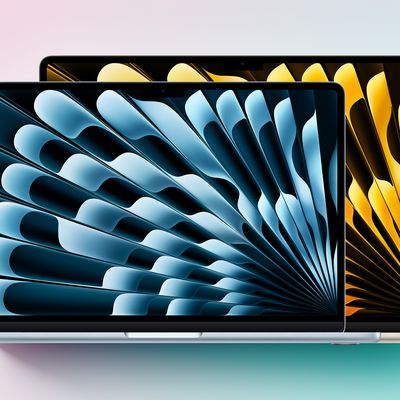
Apple today announced refreshed MacBook Air models featuring the M5 chip and a higher base SSD capacity.
The M5 chip in the MacBook Air features a 10-core CPU, with what Apple calls the world's fastest CPU cores. It offers configurations with up to 10 GPU cores with Neural Accelerators in each core, delivering up to 4x faster performance for AI tasks than the MacBook Air with the M4 chip.
...