Slack is today rolling out a redesign of its team chat app for desktop that aims to make navigating the platform's various menus and options simpler and more intuitive.
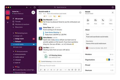
First up, the Slack sidebar is about to become a lot more flexible for users on paid Slack plans. You can now group together channels, apps, and direct messages into nested, collapsible sections using a simple drag-and-drop action.
All users will be able to take advantage of a new large compose button at the top of the sidebar that works as a way to start a message, wherever you are in Slack. When you start typing your message, Slack displays the relevant message history within the compose window to help you refer back to past chat topics.
In addition, links to Slack's People and Mentions & reactions sections have been added to the sidebar, with the aim of making searching for team members and reacting to channel pings less of a struggle.
Elsewhere, the search field at the the top of the sidebar has become more powerful, allowing you to discover key conversations, files, apps and more. There's also extra spacing between menus, panes and preferences, and an added ability to customize the sidebar width, all of which aim to make the Slack window a lot less cluttered. New color themes are also on the way.
The changes to the desktop app are rolling out today, although the developers are prioritizing new Slack users who may have just joined the service owing to an uptick in remote working due to coronavirus containment measures. Other users should see the design changes in the coming weeks.


Top Rated Comments
iOS app doesn't necessarily look any better, but it feels smoother.