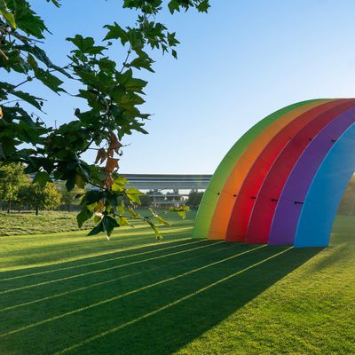
iOS 26 Adds All-New 'Clear Look' Option Alongside Light and Dark Mode
Apple in iOS 26 has introduced a third display appearance option called "Clear Look," expanding beyond the traditional Light and Dark Mode choices that have defined the iPhone experience in recent iOS versions.
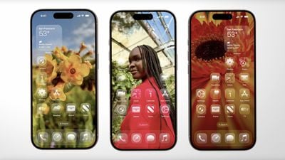
The new mode leverages Apple's "Liquid Glass" design language, unveiled as part of the company's broadest new software redesign since iOS 7. Clear Look transforms app icons using multiple layers of translucent material that dynamically responds to content and context.
Unlike Light and Dark modes, Clear Look creates a more transparent aesthetic that allows underlying content to show through interface elements. The mode works in conjunction with Apple's new universal design system, which aims to create consistency across all Apple platforms "while maintaining each device's unique characteristics," according to the company.
App icons have been redesigned to support the new appearance option, featuring the same Liquid Glass material that adapts intelligently between different lighting environments. The mode extends beyond icons to widgets and other interface elements, offering users an entirely new way to customize their iPhone's visual appearance.
The feature will be available when iOS 26 launches this fall. In the meantime, developers can grab the iOS 26 beta now, while public beta testers can get their hands on the new software from next month.
Popular Stories
Bloomberg's Mark Gurman has high expectations for Apple's first foldable iPhone.
In his Power On newsletter today, he said the foldable iPhone will be "the most significant overhaul in the iPhone's history."
"iPhone 4, iPhone 6 and iPhone X were clearly a big deal, but this is a whole new design," he said.
Like Samsung's Galaxy Z Fold 7, the foldable iPhone will reportedly open up like ...
iOS 26.5 is now available for developers, and while it doesn't include any new Siri capabilities, there are some major changes for the European Union, and smaller tweaks for features available worldwide.
Suggested Places
In the Maps app, there's a new "Suggested Places" feature that recommends locations to visit based on trending places nearby and recent searches. When Apple launches ads in ...
Apple has been celebrating its upcoming 50th anniversary by hosting surprise performances and other events around the world over the past few weeks, and now Bloomberg's Mark Gurman has revealed details about the company's grand finale.
In a social media post, Gurman said Apple's celebrations will conclude this week with a finale at its Apple Park headquarters for employees.
A special...
Popular Stories
Apple has released iOS 26.4, the fourth major point update for iPhones since iOS 26 was released in September, and there are at least 14 notable changes and improvements worth checking out. We've rounded them up below.
The update doesn't have the enhanced Siri feature set we were hoping for – that's likely to arrive in iOS 27 – but there are quite a few other new additions included. They ...
Apple today released iOS 26.3.1 and iPadOS 26.3.1, minor updates to the iOS 26 and iPadOS 26 operating systems. The software comes three weeks after Apple released iOS 26.3 and iPadOS 26.3.
The new software can be downloaded on eligible iPhones and iPads over-the-air by going to Settings > General > Software Update.
According to Apple's release notes, the update adds support for the new...
Apple today seeded the third betas of upcoming iOS 26.4 and iPadOS 26.4 updates to developers for testing purposes, with the software coming a week after Apple provided the second beta to developers.
Registered developers can download the betas from the Settings app on the iPhone or iPad by going to the General section and selecting Software Update.
iOS 26.4 and iPadOS 26.4 add multiple...