With the fourth beta of iOS 26, Apple has again made changes to the Liquid Glass design that's available across the operating system, tweaking how the menus and buttons appear in apps.

In response to criticism about too little Liquid Glass in beta 3, Apple has upped the translucency in several areas.
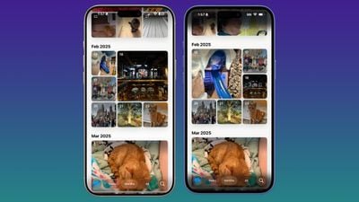 Beta 4 on left, beta 3 on right
Navigation bars in apps like Photos, Music, the App Store, Podcasts, are slightly clearer, allowing more of the background color to show through.
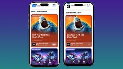 Beta 4 on left, beta 3 on right
Apple cut down on the frosted glass look, but the changes are small enough that text remains readable, so it appears to be more of a balance between beta 2 and beta 3.
 Beta 4 on left, beta 3 on right
Control Center, the Lock Screen, and the Home Screen look largely the same, so most of the transparency changes are focused on app navigation bars and buttons. On the Lock Screen, though, the background darkens as you scroll through notifications.
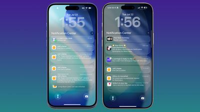 Beta 4 on right, beta 3 on left
Apple will likely continue to make small changes to Liquid Glass based on user feedback, and we won't see the finalized version of the design until iOS 26 is released in the fall.