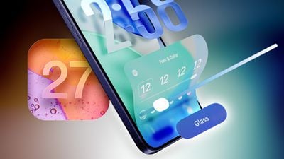
In his Power On newsletter today, Bloomberg's Mark Gurman said the latest internal version of iOS 27 does not have major Liquid Glass design changes, but there might be a new system-wide setting for precisely adjusting the look of the interface.
iOS 26.1 lets you choose between "Clear" and "Tinted" options for Liquid Glass, with the "Tinted" look adding more opacity to user interface elements. And with iOS 27, which is expected to be released later this year, Apple might go even further.
iOS 26.2 introduced a slider that allows you to manually adjust the opacity of Liquid Glass, but only for the Lock Screen's clock. Starting with iOS 27, Gurman said the setting might be expanded to the entire operating system.
Apple was initially working on a system-wide Liquid Glass slider for iOS 26, but it ran into engineering challenges when trying to extend it across the entire system, according to Gurman. However, he said Apple could go back to the drawing board and manage to get the system-wide slider working in an iOS 27 version.
"Apple is trying again now for iOS 27," said Gurman, in a social media post referring to the system-wide Liquid Glass slider. "TBD if it lands."
iOS 27 beta testing should begin in June, ahead of a September release.
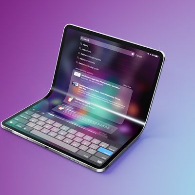
Bloomberg's Mark Gurman has high expectations for Apple's first foldable iPhone.
In his Power On newsletter today, he said the foldable iPhone will be "the most significant overhaul in the iPhone's history."
"iPhone 4, iPhone 6 and iPhone X were clearly a big deal, but this is a whole new design," he said.
Like Samsung's Galaxy Z Fold 7, the foldable iPhone will reportedly open up like ...
iOS 26.5 is now available for developers, and while it doesn't include any new Siri capabilities, there are some major changes for the European Union, and smaller tweaks for features available worldwide.
Suggested Places
In the Maps app, there's a new "Suggested Places" feature that recommends locations to visit based on trending places nearby and recent searches. When Apple launches ads in ...
Apple has been celebrating its upcoming 50th anniversary by hosting surprise performances and other events around the world over the past few weeks, and now Bloomberg's Mark Gurman has revealed details about the company's grand finale.
In a social media post, Gurman said Apple's celebrations will conclude this week with a finale at its Apple Park headquarters for employees.
A special...
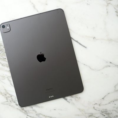
Apple will add a vapor chamber cooling system to the iPad Pro as soon as next year, according to Bloomberg's Mark Gurman.
Writing in his latest Power On newsletter, Gurman says an iPhone 17 Pro-style vapor chamber is something Apple has been working to bring to the ultra-thin iPad Pro, and it could debut in the next model, which is expected to arrive in spring of 2027.
Apple overhauled...
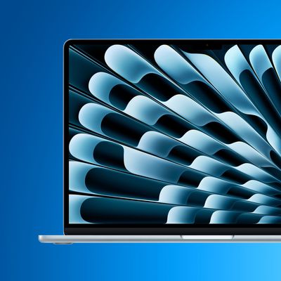
Apple will update the MacBook Air with an OLED display for its 2028 model, according to Bloomberg's Mark Gurman.
Writing in his latest "Power On" newsletter, Gurman says that he expects the MacBook Air's transition from LCD to OLED to occur with the product's 2028 update, as part of a larger migration to OLED across the company's flagship iPad and MacBook models that includes the iPad mini,...
Apple is still developing a large foldable iPad, despite hitting several technical hurdles along the way, reports Bloomberg's Mark Gurman.
Writing in his Power On newsletter, Gurman says the "gigantic" foldable iPad will challenge Apple's long-running tradition of keeping the Mac and iPad as separate devices. Some have referred to it as a foldable iPad, while others have called it an...
It's not additive or more usable to have colors & content "bleeding through" onto controls from underneath.
That may demo well for being "fun, flashy, cool and wow", but it effectively just adds friction and frustration as it lessens legibility and clarity of controls one is trying to interact with.
The seeds of this flawed ideology go all the way back to when Safari on macOS started "tinting" based upon what is behind the window. It's just insane when you think about it.
Imagine if road signs along the highway were sort of translucent and showed "hints" of the scenery behind them.
I’m not an engineer, so maybe I don’t get it. But, you can make the whole iOS look crappy. But you can’t give us 5 levels of adjustable crappiness or the ability to revert?
Precisely. Transparency isn’t the biggest issue, the concept itself is. The whole behaviour of the UI doesn’t add anything meaningful to the experience.
It’s actually quite sad looking at Sequoia now, because that interface truly subscribes to less being more.